EDUNEXUS
EduNexus, a revamp of an existing tutor platform, focuses on user-friendly design and increased student retention. Developed at Parsons School of Design, the project aimed to create an intuitive onboarding experience for students, simplifying the process of finding and booking skilled tutors for virtual appointments.

A Reimagined Virtual Tutoring Platform
Scope
UI/UX Design & Research
User Interviews & Testing
Wireframing & Prototyping
Branding & Visual Identity
Tools
Figma & FigJam
Adobe Creative Suite
Zoom
Duration
August 2022 - October 2022
at Parsons School of Design
Hypothesis
Simplifying onboarding, implementing an intuitive tutor selection process, and streamlining scheduling for students builds credibility and fosters a long-term relationship. Testing with user feedback will further refine the platform's appeal.

Key Insights
After the primary research phase and heuristic evaluation, the key areas for improvement were identified. These specific features were the focus during the creation of low and mid-fidelity designs for the new website.

Heuristic Analysis
In conducting the heuristic analysis for the sign-up and onboarding process, I reviewed the interface design based on Jakob Nielsen's 10 general principles for interaction design. I carefully examined each principle and evaluated how well the platform adhered to them, identifying areas that needed improvement and determining priorities for the redesign process.

In this flow, the solution is approached by prioritizing the student's 'education level' displayed with categories in the form of visual 3-d building blocks on the landing page. The crux of this concept is navigating through academic roadblocks with the help of professional tutors.
Concept Flow 2


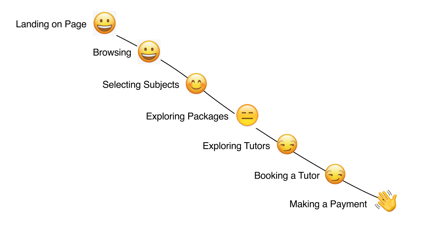
Beginning with the initial contact and discovery of EduNexus, I conducted an extensive examination of user journeys throughout the engagement process. The aim was to comprehend the reasons behind students' inability to develop long-term loyalty and advocacy towards the platform. This analysis helped me uncover specific pain points in the UX design that may not have been apparent in the heuristic analysis report.
User Journey Map
Low Fidelity & Mid Fidelity Prototypes
In this flow, the solution is approached by prioritizing the student's 'education level' displayed with categories in the form of visual 3-d building blocks on the landing page. The crux of this concept is navigating through academic roadblocks with the help of professional tutors.
Concept Flow 1


Research Space & Methodology
The research focused on high school students' preferences on online tutoring platforms, including pay rate, tutor qualifications, onboarding process ease, class durations, parental support, competitors analysis, and reasons for a drop in onboarding rates. The research methods employed were The Elito Method for observation, judgment, value & concept, and Fly on the wall observation for passive data collection. User Journey Maps were created to illustrate user experiences. The accompanying image represents the Elito hierarchy as a staircase.


User Interviews


To improve the original design, I conducted user interviews, usability testing, competitor analysis, and persona development research.
To begin the redesign process, I conduced a heuristic analysis with reference to the Jakob Nielsen's 10 general principles for interaction design in order to identify and prioritize areas for improvement in the sign-up and on-boarding process of the platform.
Original Design
The Crazy 8 Design Sprint
During the brainstorming phase, I generated eight unique ideas within eight minutes, aiming to move beyond the initial concept and explore diverse solutions. This exercise proved invaluable in generating innovative and out-of-the-box design concepts.

Moving on, a competitor analysis audit was carried out to understand the scope and positioning of existing players in the market in the field of education and academics. This was done to identify opportunities and find an edge in order for EduNexus' design to stand out from the rest. The adjacent industry audit provided valuable insights to develop a UX strategy to enhance my website's experience, brand positioning, and business value. I researched UI design examples in areas of Account Creation, Form Fields, Toggles, Radio Buttons, Buttons, Payment, Selection, Schedule, Error States, etc.

By analyzing and synthesizing multiple findings, I uncovered eight high-level patterns and insights. From these, I prioritized five areas to address and resolve in the redesign process.
Meta Insights

Storyboarding
The storyboarding exercise was vital to visualize a representation of the student and parent interaction with EduNexus. The prime motive here was to depict the product just like it would be shown in a marketing advertisement in terms of how the user would utilize it.


MVP Focus Tasks
Sign up & Sign in process flow
Ask a Finding apt available tutors
Matching user schedules with Tutor schedules
Creating a Tutor booking or reservation
Making a payment
Receiving a receipt or confirmation
User Flow Design

Final Design

PROJECT NAME

PROJECT NAME

PROJECT NAME

PROJECT NAME

